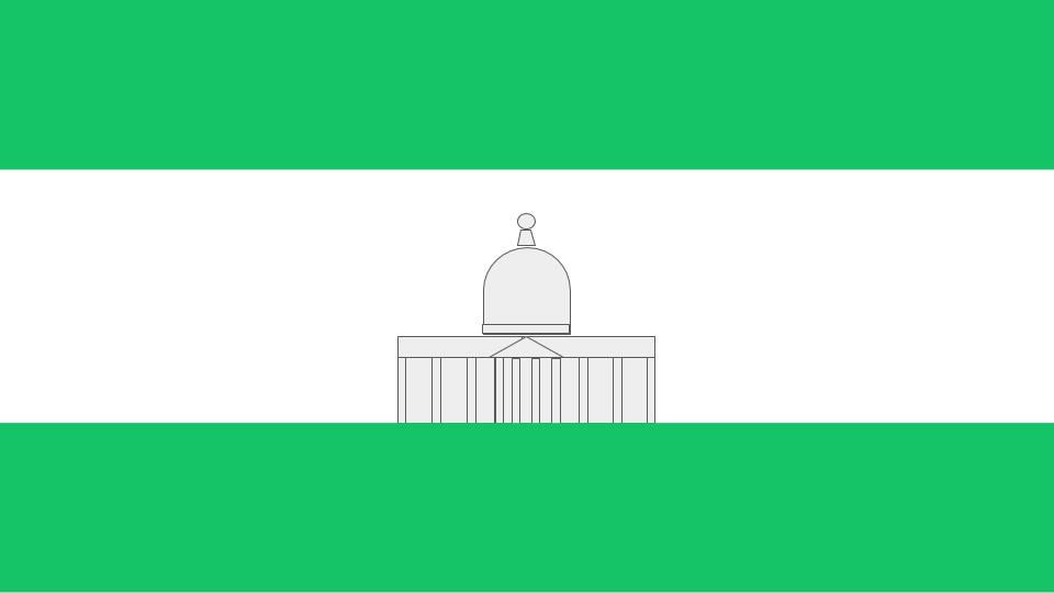
Amercian Fork
Cedar Hills
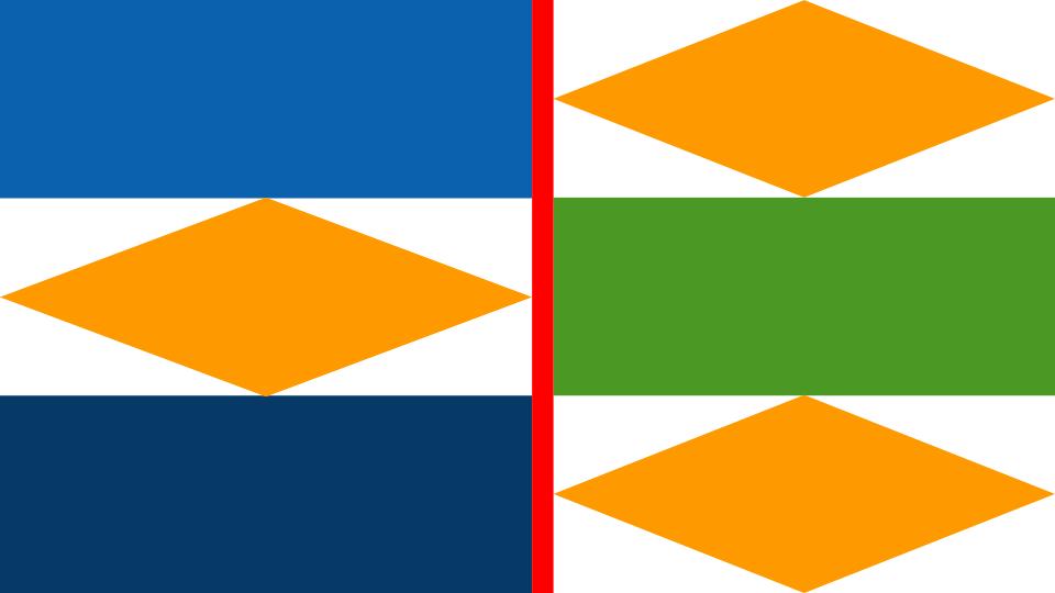
Lehi
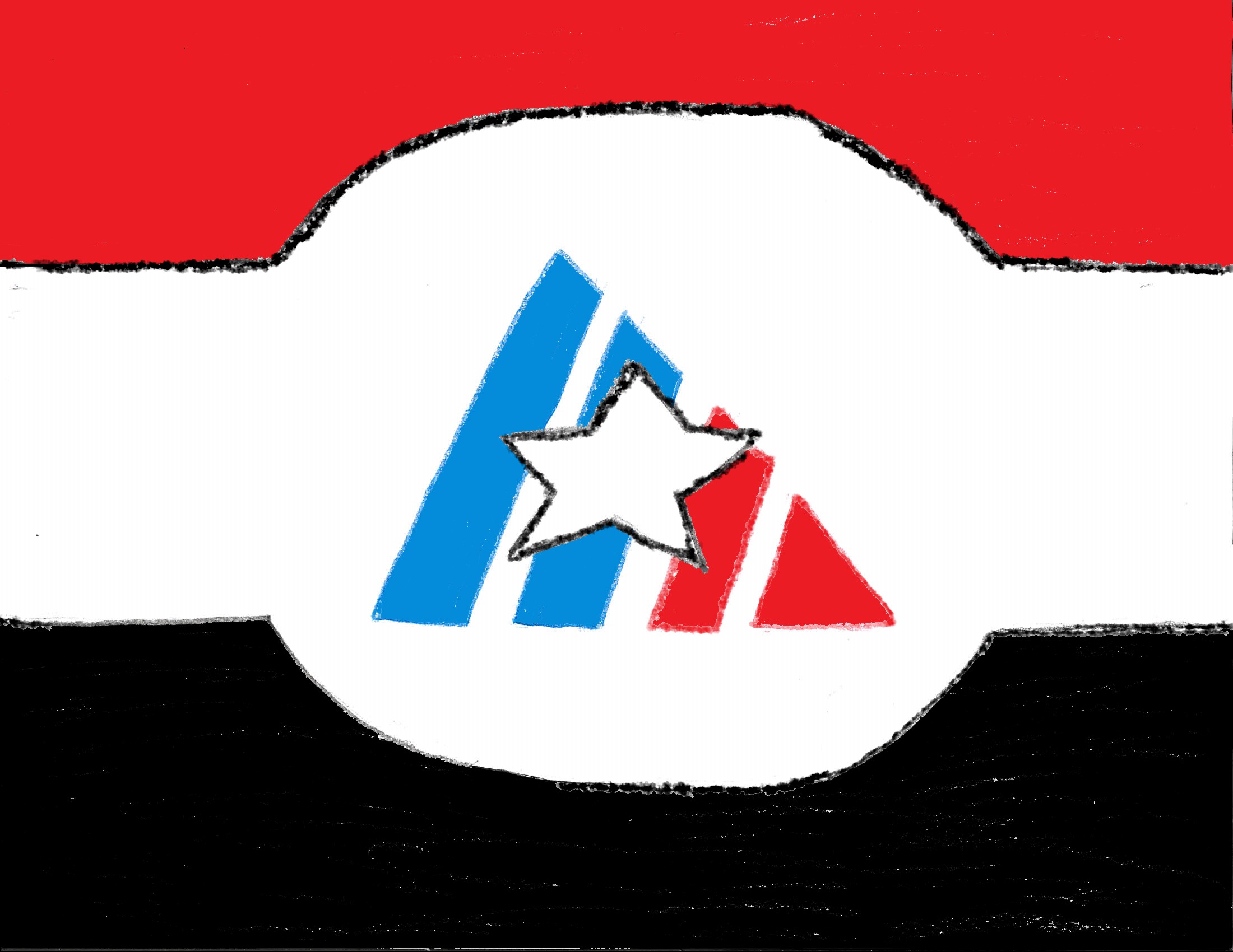
Designed by Ethan Lynsky. For the City of American Fork. "The horizontal red and steel stripes represent American Fork’s deep history in the steel industry. The triangle in the center represents the wasatch mountain range and, specifically, Mount Timpanogos. The colors of the triangle being red, white, and blue are there to represent the patriotism exhibited all throughout American Fork city."
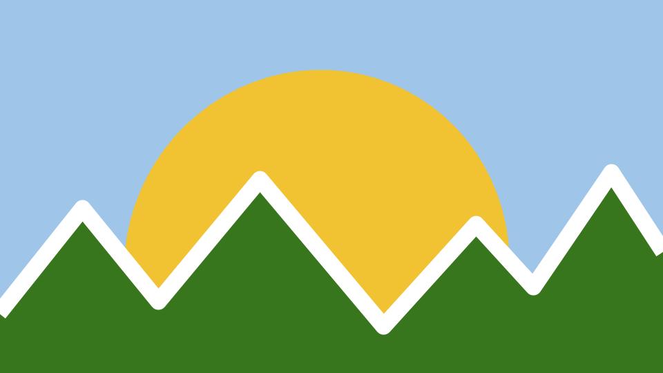
Designed by Sam Gustaveson, Anna Lisa Lyons, and Rosey Stewart. For the City of Cedar Hills. "The mountains on this flag represent the hills and mountains that make up Cedar Hills. The white line represents the trails that are in Cedar Hills. The green of the mountains represent the wildlife found all over Cedar Hills."
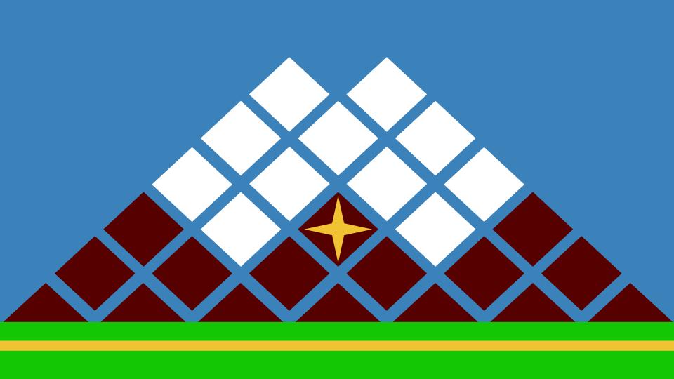
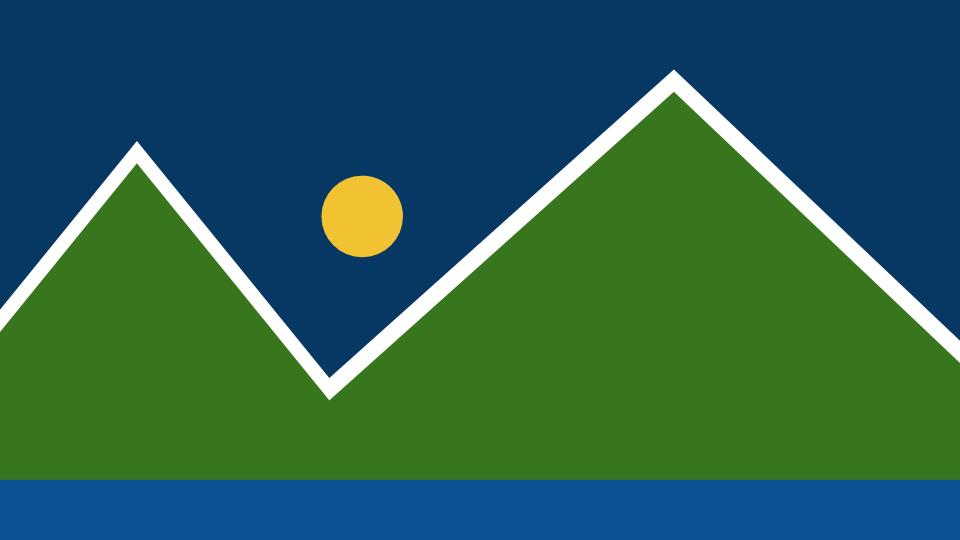
Designed by Mitch Gregory. For the City of Lehi. "Our design for Lehi City's flag incorporates what we believe to be large characteristics in what makes Lehi a great city. The green represents what is currently Lehi city's flag, and how Lehi has vast acres of grassy fields, the blue is also in Lehi's flag - and it represents the blue skies over Lehi. The mountain in the flag represents a couple things, the white top represents Silicon Slopes, which many companies have chosen to build their headquarters in Lehi which boosts the economy. The rising mountain shows growth and prosperity as we continue to climb economically. The star in the middle represents how Lehi is the center of population in Utah."

Orem

Orem
Orem
Designed by Mia Bradshaw. For the City of Orem. "For the redesign of the Orem flag I took the elements from the current Orem City flag and simplified them. The white ring around the sun is an O for Orem. The mountain is for Timpanogos mountain, and the blue is for Utah lake."
Designed by Parker Smith. For the City of Orem."The only problem that I had with the current city flag was the letting which spelled out the word “OREM” on the bottom. One of the five principles used to make all good flags specifically states that no lettering or seals be used on the flag. So, when I altered the current city flag, I simply removed the letting which spelled “OREM” on the bottom. Everything else about the flag stayed the same."
Designed by Spencer and Cole Terry, Kelton Wagley, Isaac Spencer, and Thomas Vick. For the City of Orem."This is based on the original Orem flag design, but is more geometric in style and simpler, omitting the text that was previously present"

Pleasant Grove

Pleasant Grove

Provo